
The Project: Typography Poster
The aim & guidelines for this project was to showcase the differences of two type families, one from the past decade and one beyond the past decade.
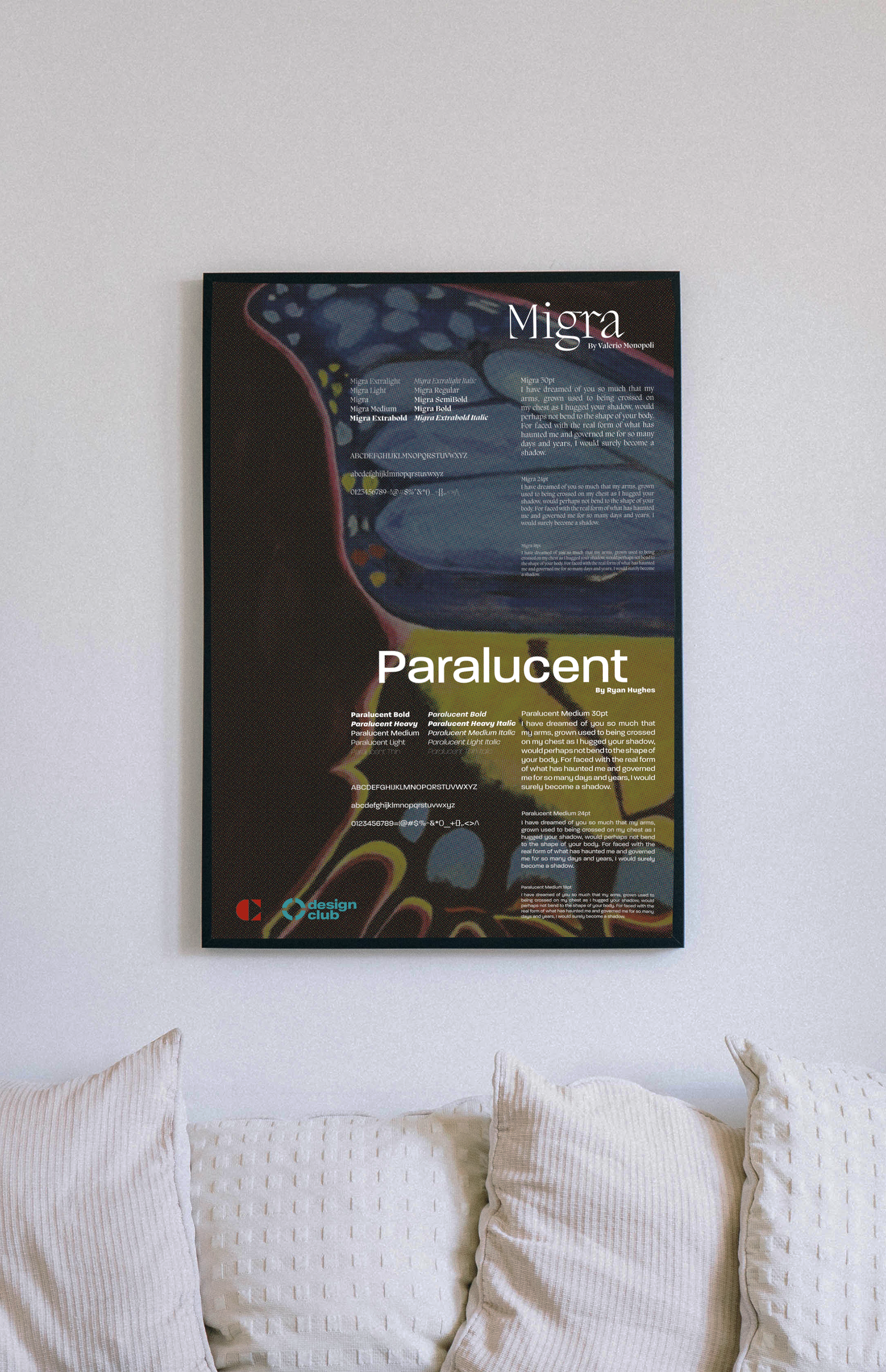
Rationale
I’ve chosen to represent and express themes of surrealism & other worldly ambience in my poster. My moodboard was filled with surreal horror/thriller movie posters from the 80’s and beyond. I tried to have a dated feel using the colour halftone effect. Using butterfly wings from two very different, but beautiful butterflies, metaphorically I wanted to convey the range and wonder of the two typefaces in a frankenstein-like manner. The medium for the background was gouache paint, I worked on the background for a week alternating between building layers and carving out the patterns. Considering the background was going to be tantalizing with texture & colour I intended for the colour choice for the fonts to be white. A small detail I wanted for that dreamy-like feeling was that instead of consistently keeping the typeface variations of light to bigger strokes I had this sort of fade-in/fade-out element.